“Design can be art. Design can be aesthetics. Design is so simple, that’s why it is so complicated.”
- Paul Rand
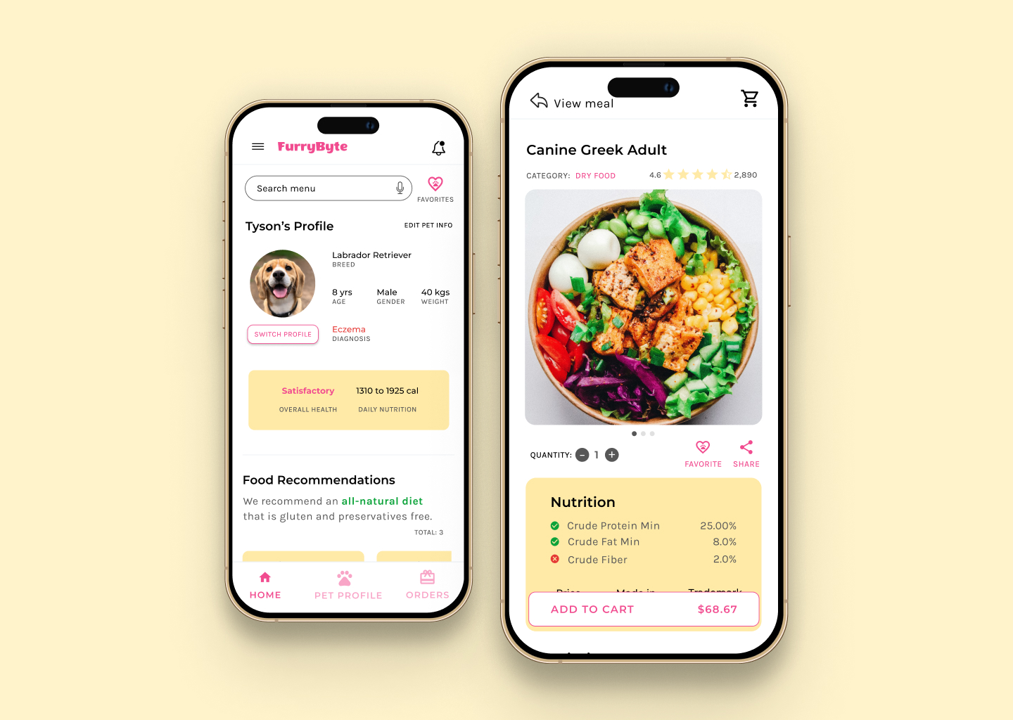
Express app was a UI design challenge to myself. In the world of user experience design, while keeping the user and user needs front and center, I realized that good user interface is the backbone to a good user experience. I wanted to hone my skills in user interface design and decided to design a delivery tracking flow.
Initially, I planned to create Express as an extension to FurryByte and create a delivery tracking flow for a dog food delivery service. But, I asked myself, how can I design it as a standalone application and not just as a dog food delivery service application. Hence I broke down the problem into smaller pieces. The goal of Express app was to:
My preliminary research revealed that users not only have challenges managing their orders but also cannot always find what they are looking for. Keeping track of orders is not an enjoyable experience and is a tedious process.
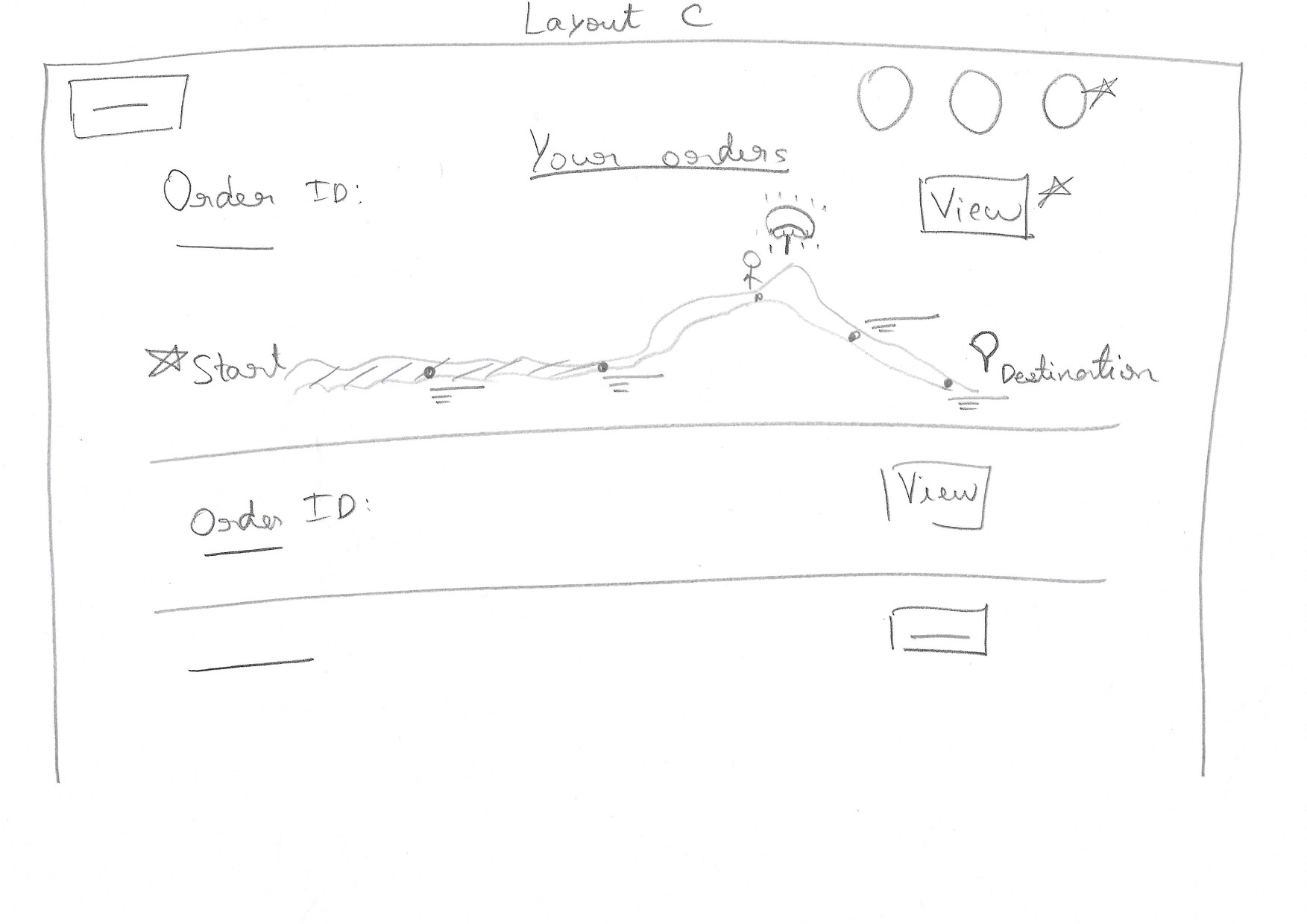
To get my ideas flowing in a small amount of time, I leveraged the crazy eights exercise. It not only encouraged me to get creative but also pushed me to think outside the box. Moreover, it helped me think about the How mighty we questions and clearly communicate my ideas and I realized that I love to sketch!
Creating the paper wireframes helped me organize my ideas and add important elements that would address user pain points. It encouraged me to lay out a clear workflow and prioritize an easy way to access orders.
I took into account the information architecture, studied the elements I had added in my paper wireframes and evaluated their placements in the digital wireframes. Once I was satisfied with the paper wireframes, I began creating digital wireframes. I selected two frames i.e. desktop and mobile screens and added a layout grid to keep everything lined up accurately.


While working on my designs, I focused on hierarchy of information, making it easier for the viewer to read and digest the information and bringing the most important information to the forefront.
I emphasized on legibility by using typography in my mockups. I experimented with different weights and sizes of typefaces to establish a visual hierarchy of the information on each page.
Not long ago, I read The Complete Color Harmony: Pantone Edition book by Leatrice Eiseman and took inspirations from it for my website. The emotions I wanted to go for were reliability, dependability, authenticity, honesty, and genuineness, hence, I used colors from the blue family to create an emotional connection. Additionally, I used icons to communicate information in a visually appealing way.
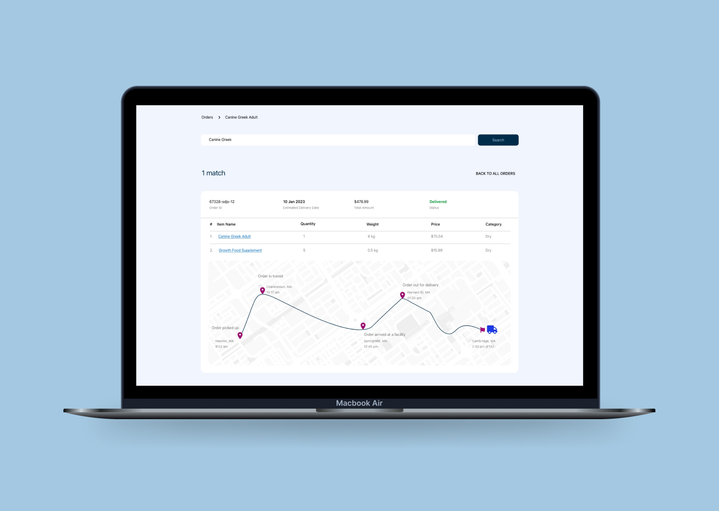
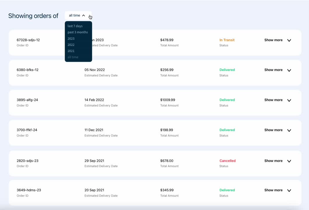
I removed the mode of payment which the majority of the users did not find very useful. Users can see all active and past orders at a glance. They can either search for a specific order through the search bar or expand on any order to view its details.

I used an accordion UI to highlight the key information and allow my users to toggle between orders, they can expand on an order to see more details.
Hamburger menu provides a clean UI by hiding away navigation links neatly confined to one section, users can find more options and functionality like settings, product offerings, etc. by clicking on the navigation menu
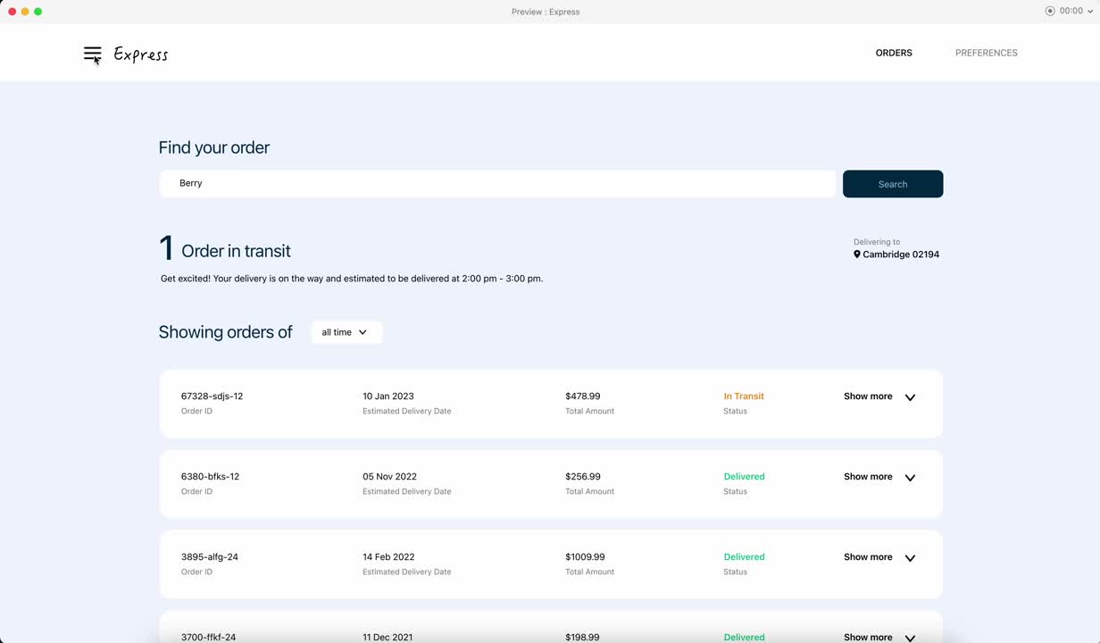
Testing the low fidelity mockup with potential users, I found out that participants appreciated the regular/live updates about their order. It set clear expectations and kept them up to date. Hence, I added key information such as estimated delivery date, order status along with up-to-date map locations and upcoming deliveries (for e.g. 1 Order in transit in the following image) on the Orders page. Additionally, the item name section has hyperlinks which is a shortcut to the product page.

Added a new screen to manage preferences. User can easily add/remove addresses and set default a address. Added preferred delivery windows

I had helluva fun working on this UI challenge. I had freedom with my designs but I am grateful to my friends, colleagues and mentors who were willing to spare their precious time to provide feedback. It taught me a ton and helped me strengthen my design skills. I learned that UI is much more than just creating pretty art; it makes or breaks the user experience, it is functional, accessible and addresses users' needs.
Sometimes I tend to get overwhelmed with all the possible outcomes to a problem; throughout this project, I forced myself to break the problem into smaller pieces, understand the requirements, set clear goals, implement and test, iterate and refine the solution.
While testing my prototypes I spent some time reworking on the design based on user feedback. I realized that it was time consuming and tedious. My takeaway was to make instances/components of elements like nav bar, buttons, menus and the like to save rework and duplication of efforts. In the initial phases I also contemplated the possibility of design changes and growth, my goal was to keep my designs dynamic and flexible.
Since my transition, I have realized that my background in computer science and engineering is one of my greatest asset and has helped me to be effective and efficient in more ways than I had imagined. I am able to leverage my knowledge to recognize patterns, communicate effectively and design responsibly.