role
Solo UX Designer
client
Google UX Design course
project duration
2 months
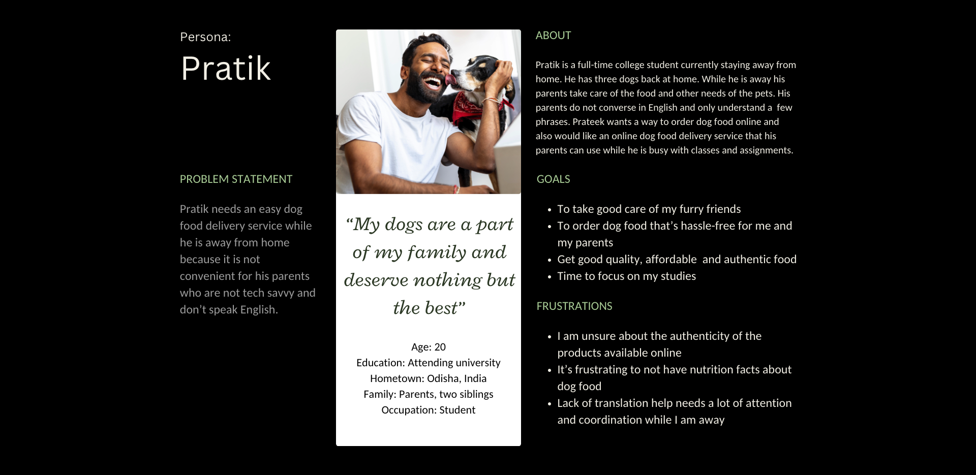
"My dogs are a part of my family and deserve nothing but the best."
- Test participant
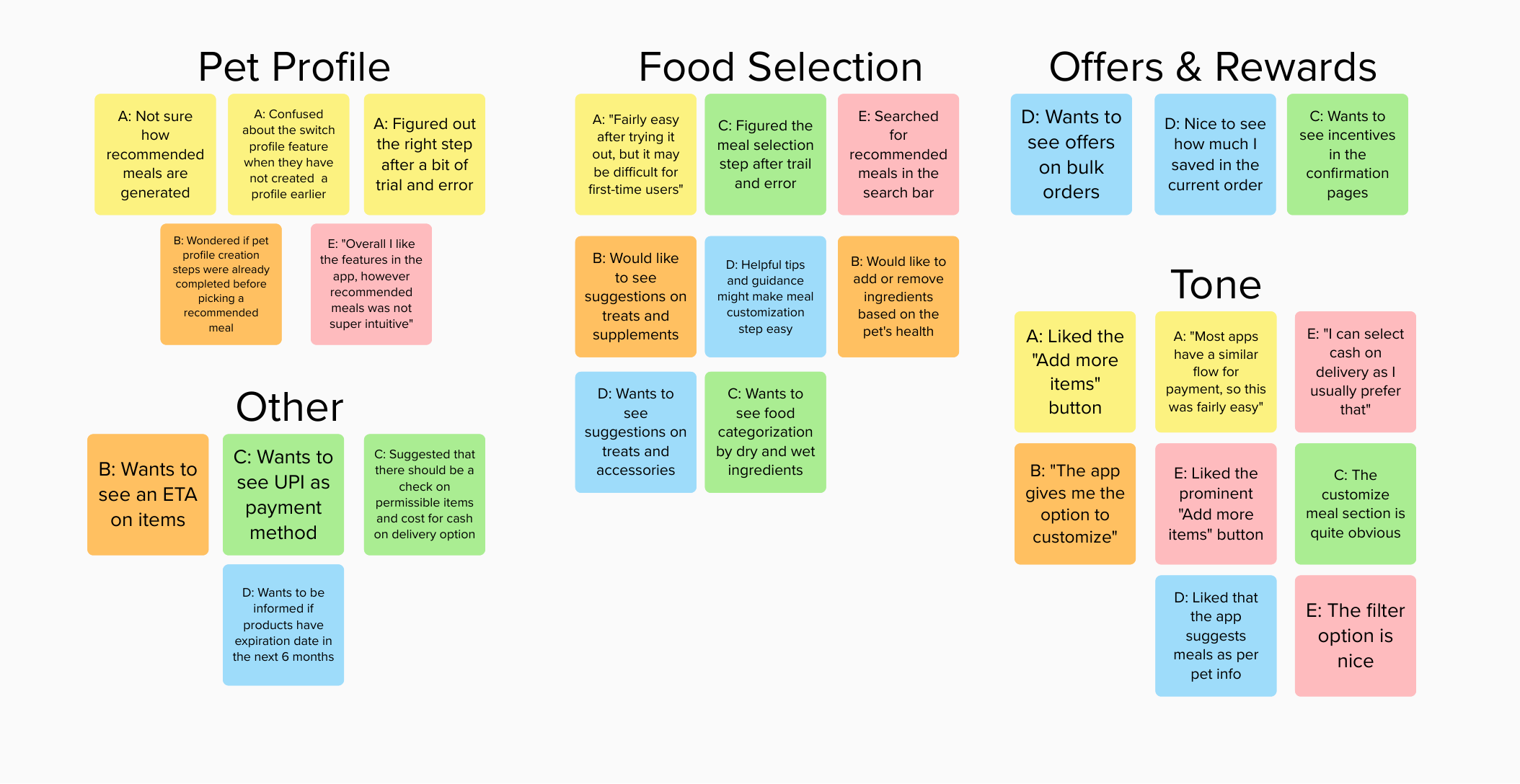
Introduction
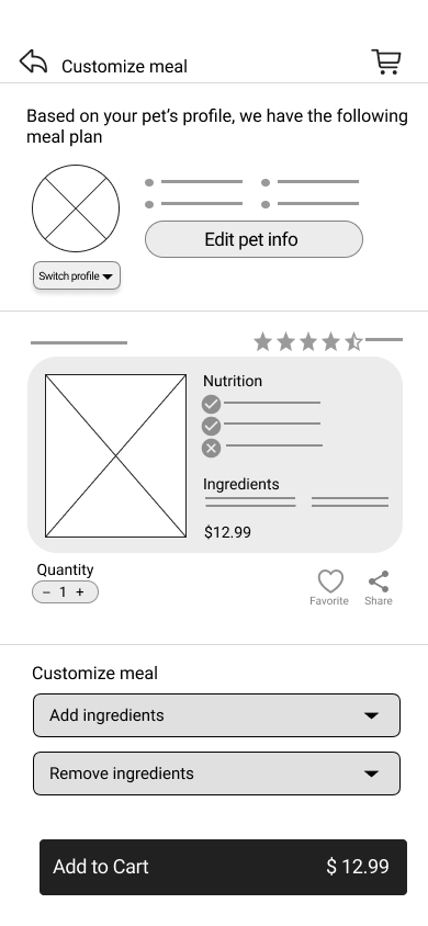
FurryByte is the personal food planner for your furry friend. My top priority while designing FurryByte was the dog's health and users' needs. In doing so I had to think about the current issues dog parent's face and offer a perfectly balanced meal plan with the least amount of planning.